
The Challenge
How can we improve the search experience of a homebuyer?
At the start of this project, our goal was to enhance the search experience on the website. This evolved into a redesign of the homepage search control and the creation of a new search page featuring more detailed results, along with a user interface that facilitates quicker, more granular browsing.
We also made improvements to streamline the user journey, helping visitors smoothly transition from the search page to product and community pages.
Competetive Analysis
Understand how our competitors address user search abilities on their sites.
We wanted to learn how our competitors introduce themselves as homebuyers, how they share their story, their assets and how they guided a user through a search of new home. We complied a list of each feature or asset to help guide our own development.
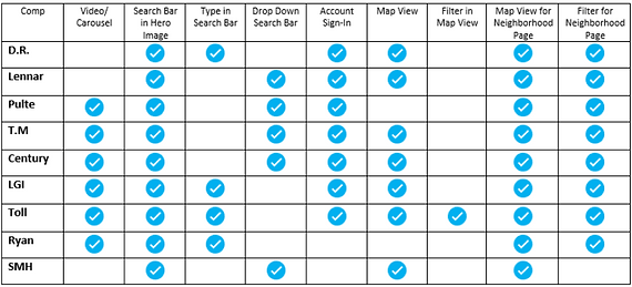
We compiled a list of features and assets by studying various homebuilder websites to analyze how other applications facilitate the search for a new home.
We analyzed seven homebuilders, encompassing both nationwide and localized builders, and documented how users navigate the exploration of their products.
Key Takeaways
01
The search component was always the first thing a user saw.
We concluded that this is important to an user because they want to get straight to their search. The most important piece of the component was being able to get granular with the search. (Zip Code vs. Regional Location)
02
A hero video was a big highlight on many sites.
This added visual interest as well as getting a user’s attention to the brand quickly and aesthetically.
03
A map view was on every homebuilder site.
A user would like to see a map view when viewing a listing. A visual representation of where the home is located aided in the search. There was also options to toggle off the map for flexibility of user preferences.
Research and Personas
Understand who our users are and how they search for homes.
We wanted to learn who was our primary user group and what pain points or motivations they had when they were buying a new home. We pulled research from prospects and home buyers to see how they landed on the site, what was important to them as home buyer, what frustrated or confused them as they navigated the site and ultimately led them to choose Stanley Martin or search elsewhere.

We pulled data from a research project that asked a serious of questions from prospects and home buyers.
We devised a questionnaire that asked questions related to family size, location, job occupation, income, the source of site discovery, and aspects that caused frustration or confusion during site navigation. Utilizing the gathered data, we formulated three prominent personas: "Couple (Rent To Own)," "Family Upgrader," and "Downsizing Active Adults."
Key Takeaways
01
People are somewhat unsure what encompasses a new home build.
We found that people didn’t know how new home construction worked including terms, processes, selections and pricing.
02
Competing with platforms that service many builders such as Zillow and Redfin.
A user will land on our site from Zillow or Redfin but we have to make sure they felt motivated to continue the home buying process on our web application.
03
Price and Location was a big motivation for purchasing a home.
Price and location is how users usually begin a search so being transparent and allowing for an user to browse with these filters in mind was an important requirement.
User Ability Testing and Interviews
Did our new home page and search page work to deliver a more easy and direct search?
We wanted to dive into our new search bar, new search filters, new home page content, UI elements on home cards and see if that helped a user find their “perfect home” and build confidence in our brand.

Conducted User Interviews to review and gather feedback on our newly design search and home page.
We held 10 interviews, 30 mins each with participants that meant a certain criteria. We evaluated their natural flow and they browsed the site and then assigned certain tasks. These were live interviews where we saw the user view our site, navigate it on their own. This allowed use to see their reactions and flow in real time and ask questions.
Key Takeaways
01
People were unsure what certain industry terms meant.
We found that people didn’t know how new home construction terms. We worked to create more user friendly terms and add info icons to help provide more context.
02
Issues finding media assets and how they were displayed.
Users were used to looking into a gallery for a floorplan and now seeing it outside in a separate area. They didn’t seem to spend time on other media assets just the gallery.
03
School Information is very important.
School information is a big must for many users. If they can stay in the same school district or even search by school district, it would help aid their search.

The work shown here was completed during my time at Stanley Martin Homes, LLC and some is publicly available through StanleyMartin.com. All materials presented are for portfolio purposes only and do not include any proprietary or confidential information.